

Product & UX
- User Research
- Data Analysis
- Product Strategy
- Prototyping
UI & Visual Design
- UI/UX Design
- Interaction Design
- Design Systems
- Accessibility
Front-End & Tools
- Front-End Dev
- HTML/CSS/JavaScript
- GSAP Animation
- Figma & Adobe Suite


Overview.
Role: Product Designer — Strategy, UX/UI, Prototyping, Interaction Design
Timeline: 6 Weeks (Multi-App Installation Project)
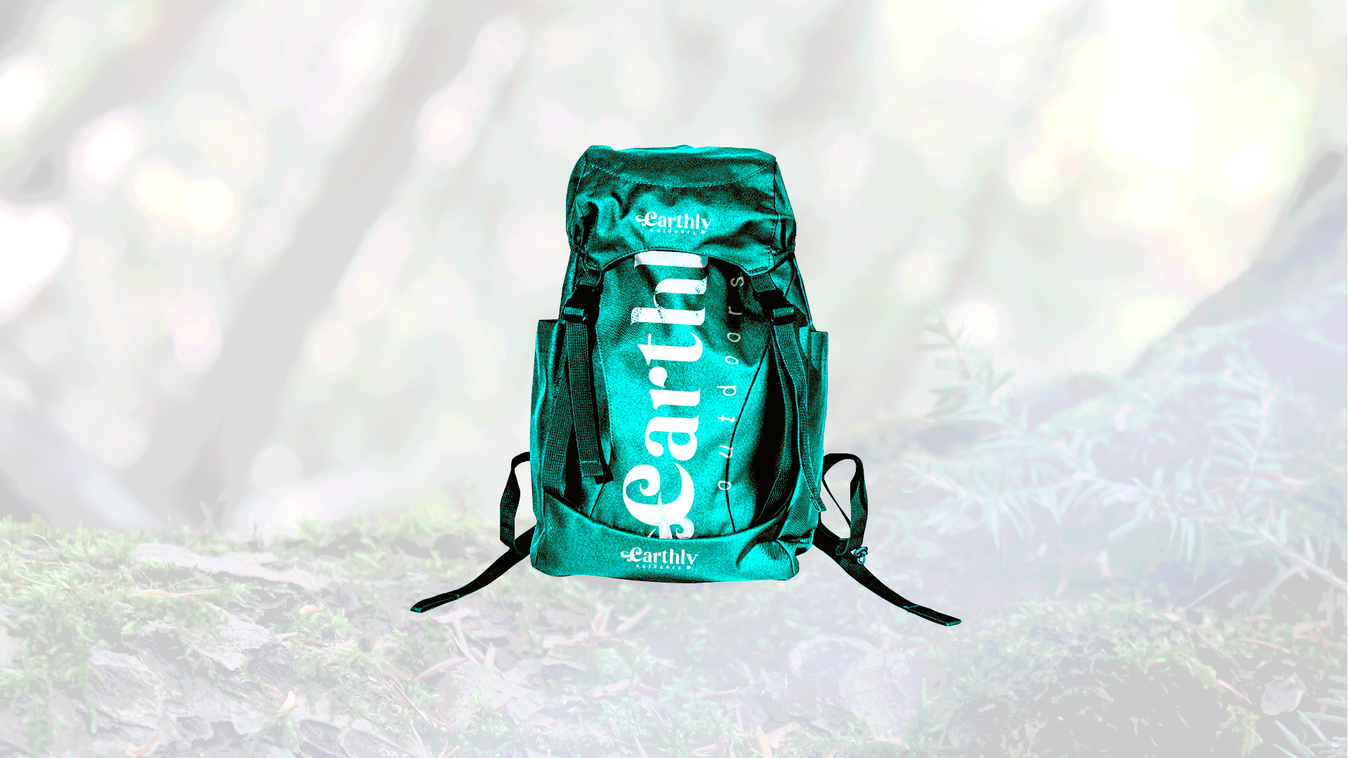
Earthly Outdoors required a multi-station digital retail experience that combined interactivity, motion graphics, and product storytelling for an in-store environment.
I designed and developed three integrated installations:
360˚ Touchless Rotating Product App
— a Leap Motion-powered, gesture-based product explorer
Dual-Touchscreen Catalogue Ordering App
— a dynamic two-screen shopping interface
QR Code Promo Videos
— looping brand and product highlights designed to attract attention
The business goal was to capture shopper attention, extend product exploration, and create a more memorable brand experience inside the retail space.
My role covered end-to-end design and front-end implementation, ensuring visual cohesion, intuitive user flow, and seamless animations across all stations.
Tools.
Design & Prototyping

Motion & Video

Front-End Implementation

Process.
The design process focused on balancing novelty with usability. Each station had to be visually compelling while guiding shoppers intuitively through the interaction. My work spanned concept sketches, UI design, motion graphics, and full HTML/CSS/JS development.
Station 1
360˚ Touchless Rotating Product App
This station was designed to stop foot traffic and invite interaction without touch aligning with Earthly Outdoors’ goal of creating a modern, hygienic, and immersive retail moment.
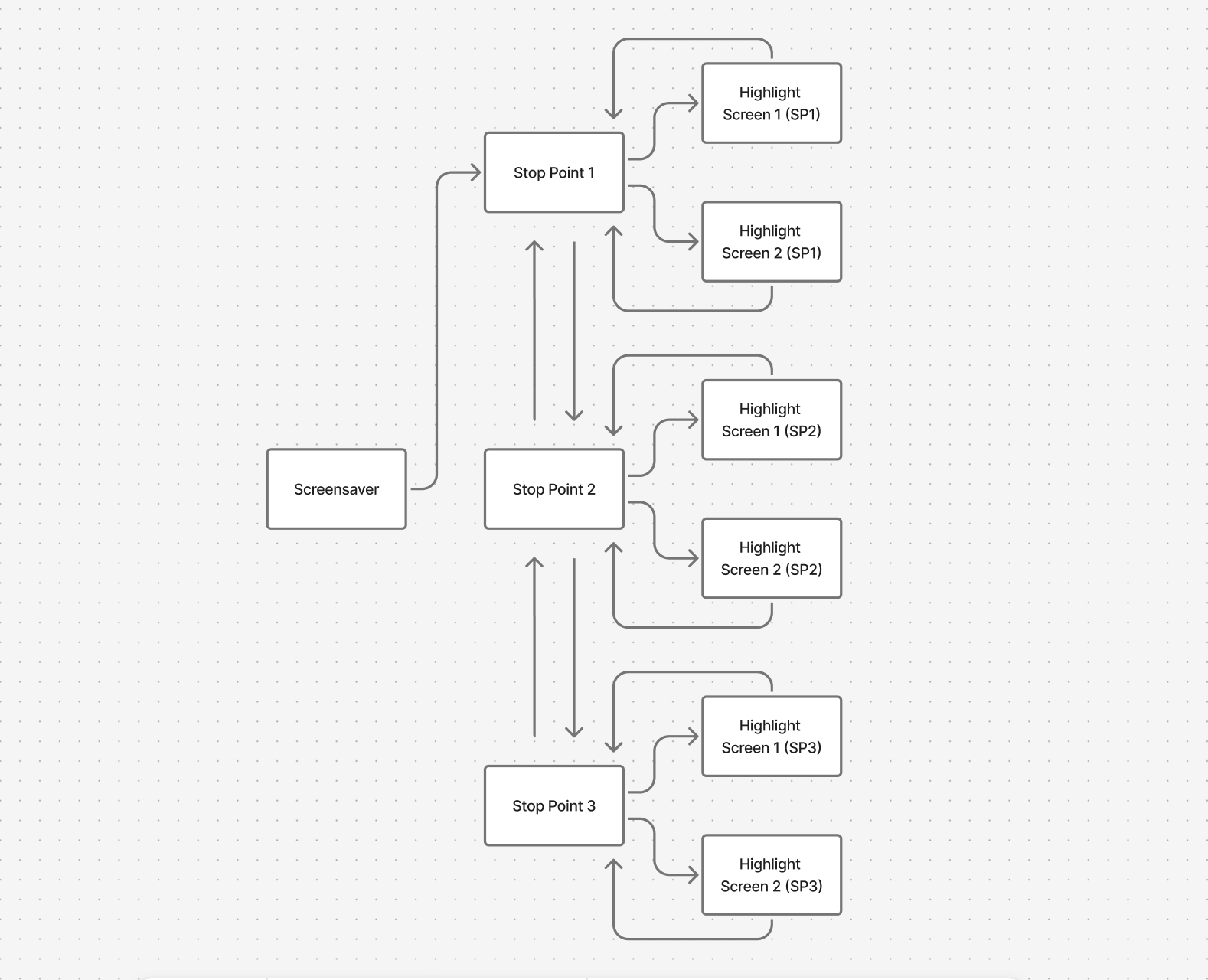
Design & Development Highlights:
Captured and edited a 15-frame product image sequence for smooth 360° rotation
Designed and animated schematic overlays (spinning ellipses, callouts) highlighting product features
Developed custom HTML/CSS layouts and implemented JavaScript variables for sequence timing and stop-points
Created a looping screensaver video showcasing the product’s features and gesture controls
Optimized assets (SVG logo overlays, image compression) for performance on large
1920 × 1080 displays
Station 2
Dual-Touchscreen Catalogue Ordering App
This app addressed the need for a clear, intuitive way to browse and purchase products, encouraging shoppers to move from exploration to conversion.
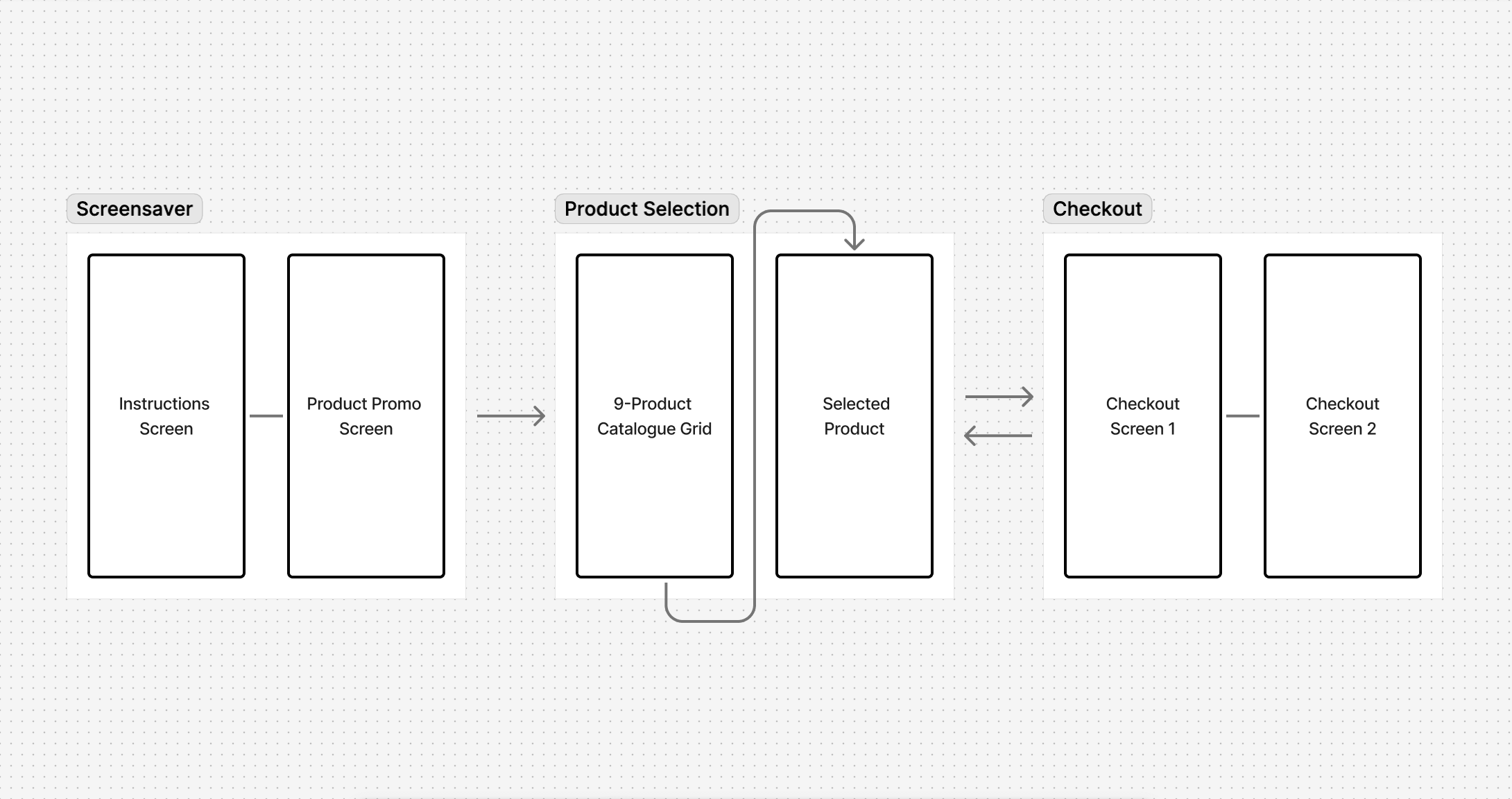
Design & Development Highlights:
Designed a 9-product catalogue grid, with a feature product given visual prominence
Built HTML/CSS layouts and integrated product.js data for each product (name, specs, colors, sizes)
Developed animated transitions with CSS and GSAP for smooth screen-to-screen interactions
Designed looping screen saver videos for both screens, combining app instructions and promotional product highlights
Styled and implemented dynamic cart and checkout screens (with custom buttons, swatches, and receipt visuals)
Station 3
QR Code Promo Videos
This component extended engagement beyond the store, letting customers continue product discovery on their mobile devices.
Design & Development Highlights:
Designed motion graphics sequences with brand-driven typography and pacing
Integrated QR call-to-actions into video overlays while maintaining alignment with the installation’s visual language
Exported optimized video files (H.264, adaptive bitrate) for seamless in-store
playback
Final.
The three installations worked together to deliver a unified, interactive retail journey — combining gesture-based exploration, touch-driven catalogue navigation, and immersive motion graphics.
For Earthly Outdoors, this meant:
Higher customer engagement time at product stations
A more memorable brand experience that blended digital + physical retail
A scalable system adaptable for future product launches
Insights.
Strengthened my ability to merge front-end coding with design thinking, using HTML/CSS/JS to bring UI concepts to life
Learned how to design for specialized hardware (Leap Motion sensors, dual touchscreens) and optimize for real-world performance
Developed cohesive branding and motion systems across three distinct apps
Reinforced the value of designing for business outcomes, not just user interfaces

Overview.
Role: Product Designer — Strategy, UX/UI, Prototyping, Interaction Design
Timeline: 4 Weeks
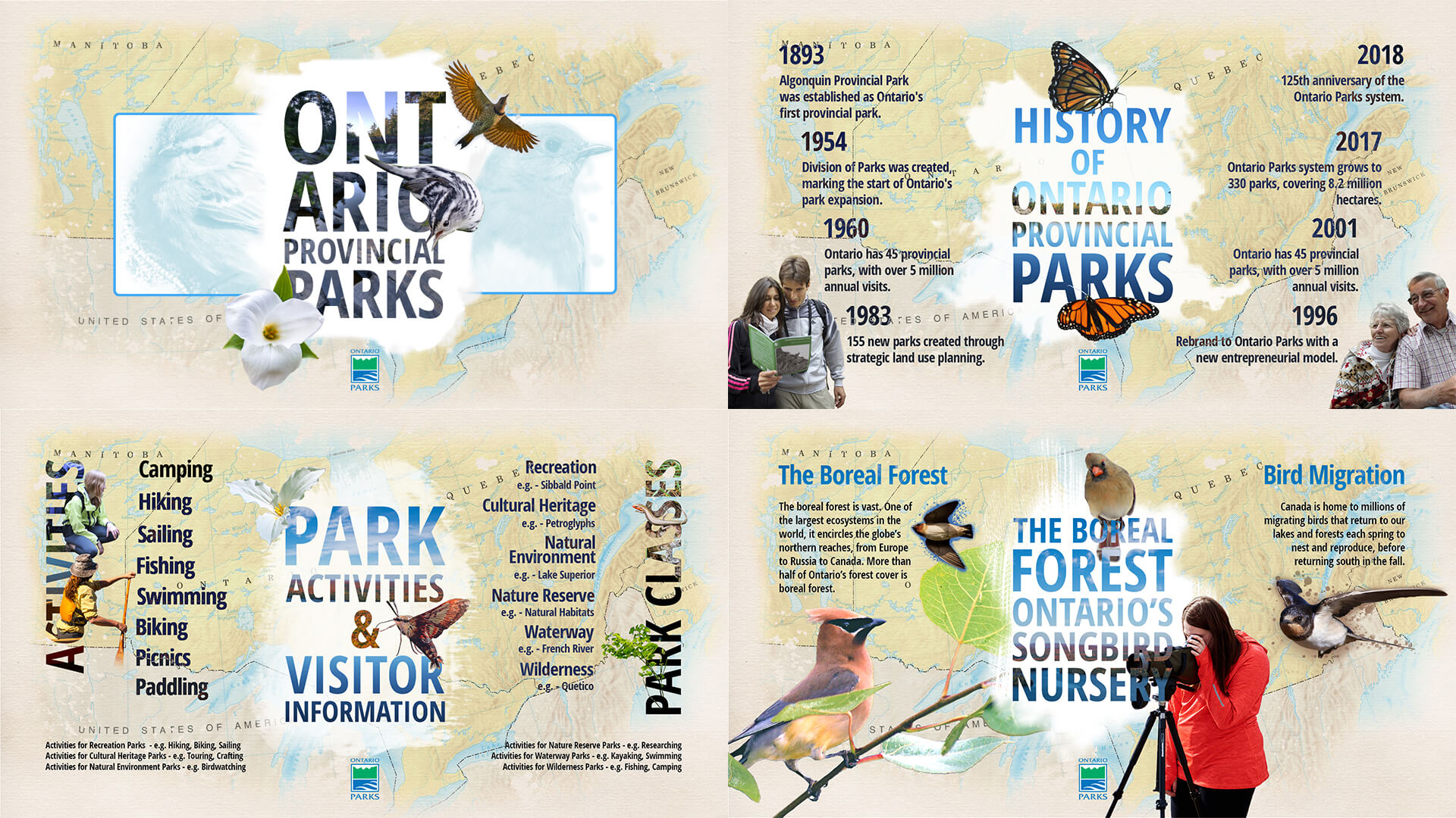
Ontario Parks needed a touch-optimized, interactive experience for public kiosks across park offices and visitor centers.
The business and user goals were clear:
Inform visitors about park history, environmental impact, and classifications
Engage diverse audiences — families, seniors, children and international visitors
Support brand storytelling while keeping navigation simple and accessible to all
I led the project end-to-end, ensuring the app was both educational and engaging, while meeting the constraints of kiosk hardware and a public setting.
Tools.
Design & Prototyping
Front-End Implementation
Challenge.
Designing for a public-facing kiosk meant balancing clarity, engagement, and accessibility under tight constraints:
Interface had to be intuitive, large-format, and tap-friendly
Navigation depth needed to remain minimal for all ages
All visuals optimized for performance on kiosk hardware
Animations had to support usability rather than distract
Process.
1. Content Planning & UX Strategy
Analyzed Ontario Parks' educational material and grouped it into 4 content zones
Designed a linear flow with low cognitive load, prioritizing glanceable visuals
Created kiosk-specific UX patterns — larger buttons, fewer screens, and no scrolling
2. Wireframing & Visual Design
Sketched initial wireframes to validate spatial structure and content flow
Crafted visual designs in Photoshop, exporting clean layers for web development
Balanced nature-inspired aesthetics with brand guidelines to keep it professional
3. UI Development & Motion Design
Built the app for a 1920 × 1080 kiosk display using HTML/CSS/JavaScript
Used jQuery + GSAP for seamless animations (fade-ins, slides, UI transitions)
Developed a custom image-sequencing module to create depth in storytelling
4. Testing on Hardware
Ran usability checks on actual touch-enabled monitors
Adjusted button hit areas and padding based on real interactions
Fine-tuned animation speed and content timing for clarity and responsiveness
Final.
The result was an interactive kiosk app that brought Ontario Parks’ stories and landscapes to life through bold imagery, intuitive navigation, and smooth motion.
Visitors could:
Learn quickly through scannable layouts and tap-friendly interactions
Explore confidently, regardless of age or tech familiarity
Connect emotionally with Ontario Parks’ history and mission through layered imagery and storytelling
For Ontario Parks, the kiosk delivered:
A more engaging visitor center experience
A scalable platform for future educational content
A tool that strengthened brand storytelling in physical spaces
Insights.
Designed with an accessibility-first mindset for a broad public audience
Focused on scannable layouts, large tap targets, and responsive visual cues
Reinforced brand storytelling with layered imagery and motion
Strengthened ability to translate static UI designs into animated, touch-ready interfaces
Learned how to design for non-traditional digital contexts, balancing hardware constraints with user needs

Overview.
Role: Product Designer — Strategy, Branding, UX/UI, Prototyping, Motion Design
Timeline: 4 Weeks
This project explored how a unified restaurant family could extend its brand digitally while giving each eatery its own distinct personality.
The challenge was to design a mobile-first app prototype that:
Expressed a cohesive family brand identity across three restaurants
Allowed each restaurant to shine through unique branding, color, and typography
Delivered a smooth, intuitive user experience from splash screen to reservations
I shaped the concept from brand strategy through to interactive prototype, ensuring the app not only looked polished but demonstrated how digital design can scale across multiple sub-brands.
Tools.
Design & Prototyping
Front-End Implementation
Challenge.
The core product challenge was to design an app that felt like a single ecosystem while still highlighting the individual character of three restaurants.
Key considerations:
Balance brand cohesion and individuality across multiple eateries
Ensure touch-friendly, responsive navigation for a mobile-first experience
Integrate SVG-based motion design without compromising performance
Process.
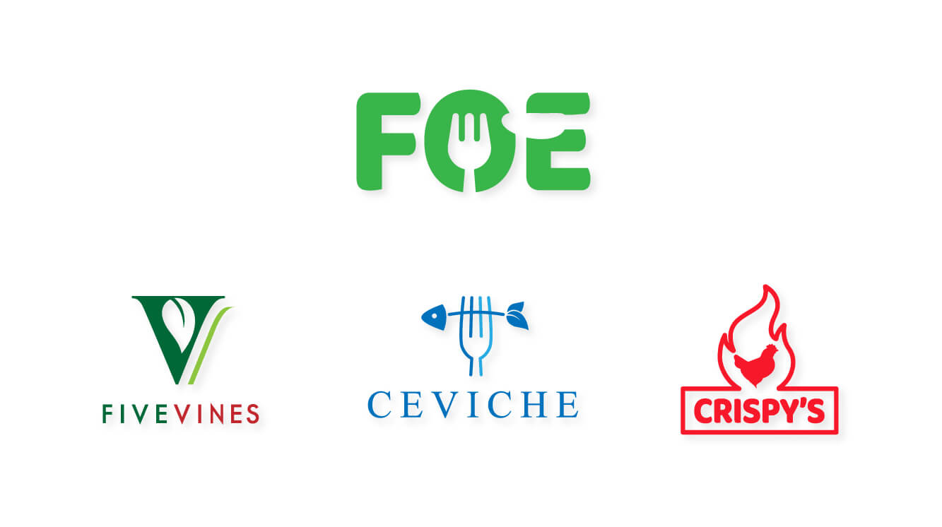
1. Brand & Asset Development
Designed the Family of Eateries main logo to anchor the shared identity
Created three distinct restaurant logos, fonts, and palettes to reinforce individuality
Produced a layered SVG splash screen designed for GSAP-driven animation
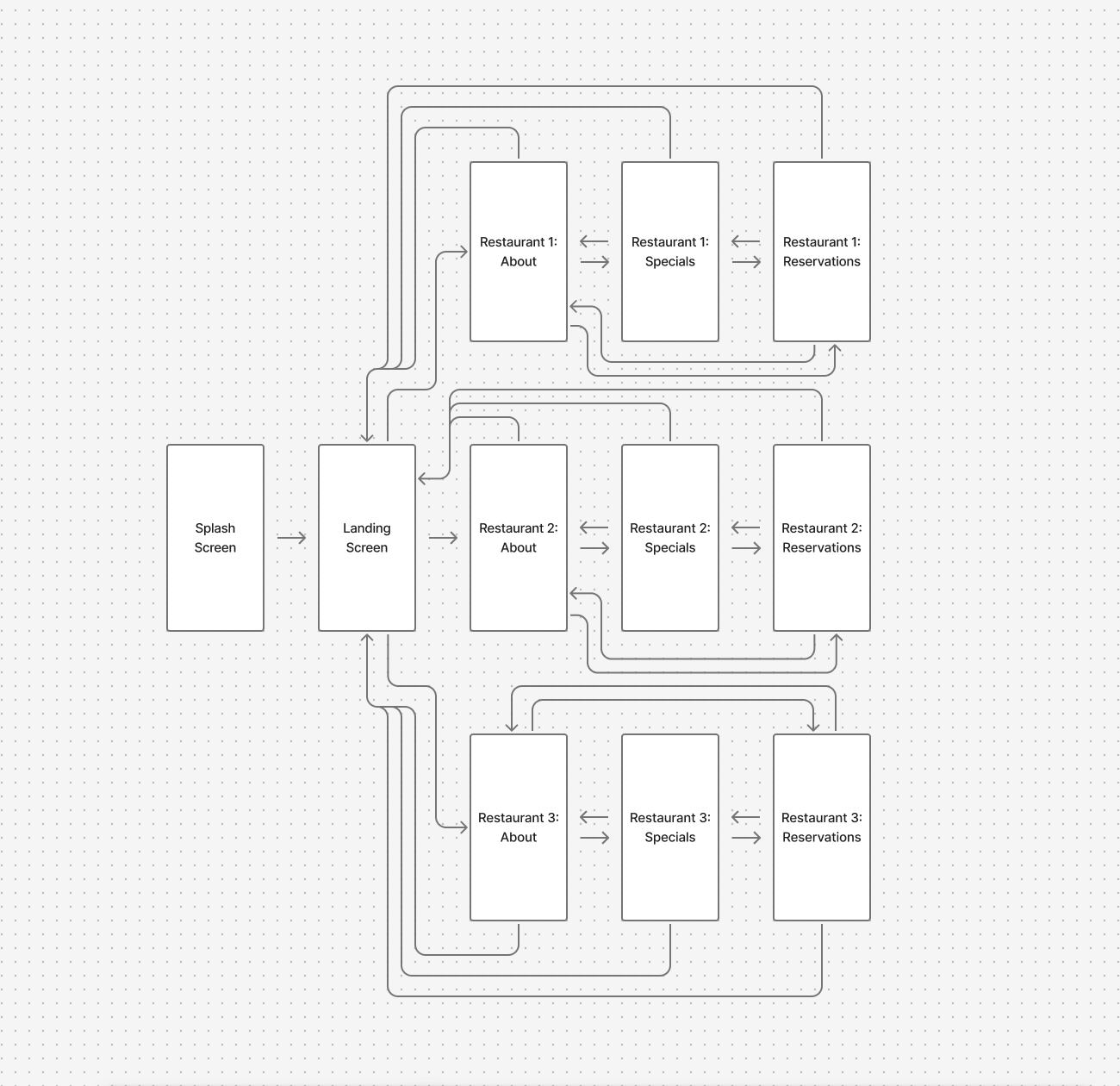
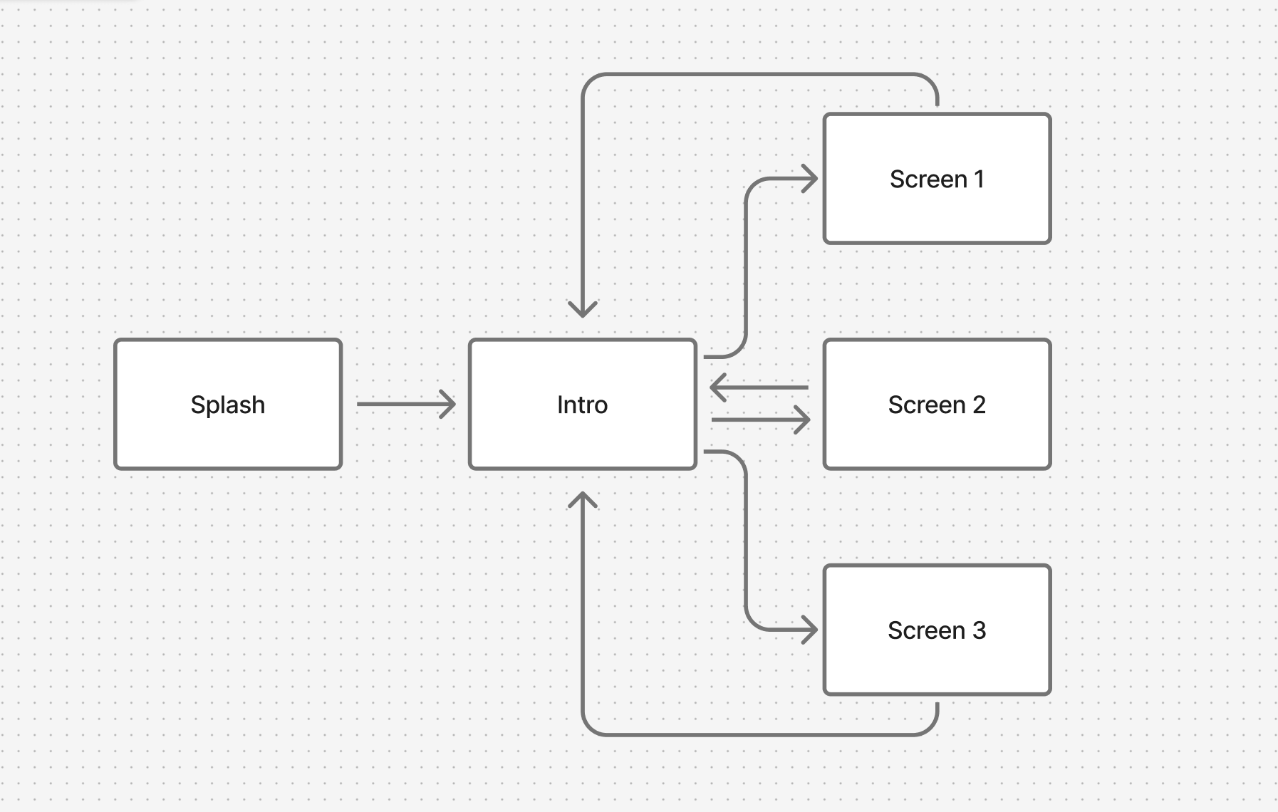
2. Interaction Flow & Prototype Structure
Developed an animated splash page as an entry point to strengthen brand recognition
Landing page showcased the three restaurant logos with subtle motion to invite interaction
Defined a clear navigation model: tap logo → enter restaurant → explore About, Specials, Reservations
3. Screen Design & User Flow
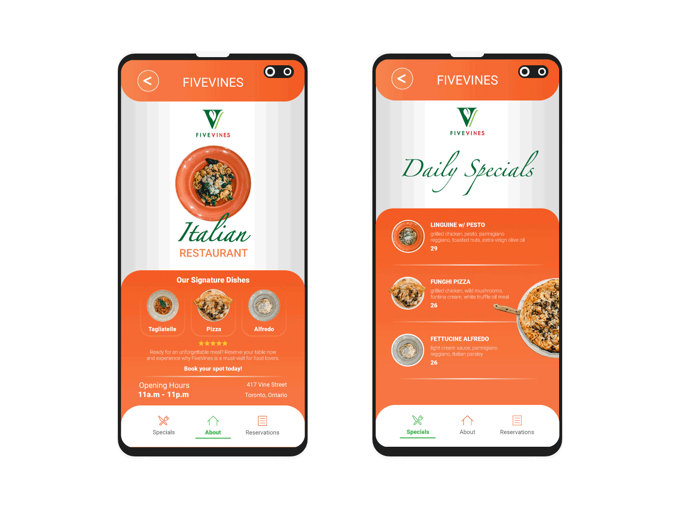
Crafted unique About, Specials, and Reservations pages tailored to each restaurant’s brand personality
Integrated a back navigation button for seamless return to the landing page
Built a responsive reservations form optimized for mobile entry
Implemented smooth page transitions using GSAP + external CSS/JS
Final.
The final prototype demonstrated how a multi-brand digital product could balance cohesion and individuality.
Key results:
Unified family branding strengthened by a custom animated splash screen
Distinct restaurant experiences through typography, color, and imagery
Mobile-first, tap-friendly navigation that guided users intuitively through key flows
Scalable app framework adaptable to additional restaurants or features
Insights.
Learned how to balance brand consistency vs. sub-brand uniqueness in one product
Advanced ability to integrate SVG + GSAP motion design into UI prototypes>
Strengthened skills in responsive design and scalable navigation structures
Reinforced the importance of storytelling through branding + interaction design

Overview.
Role: Product Designer — Information Architecture, Visual Design, Prototyping
Timeline: 4 Weeks (In-House Project)
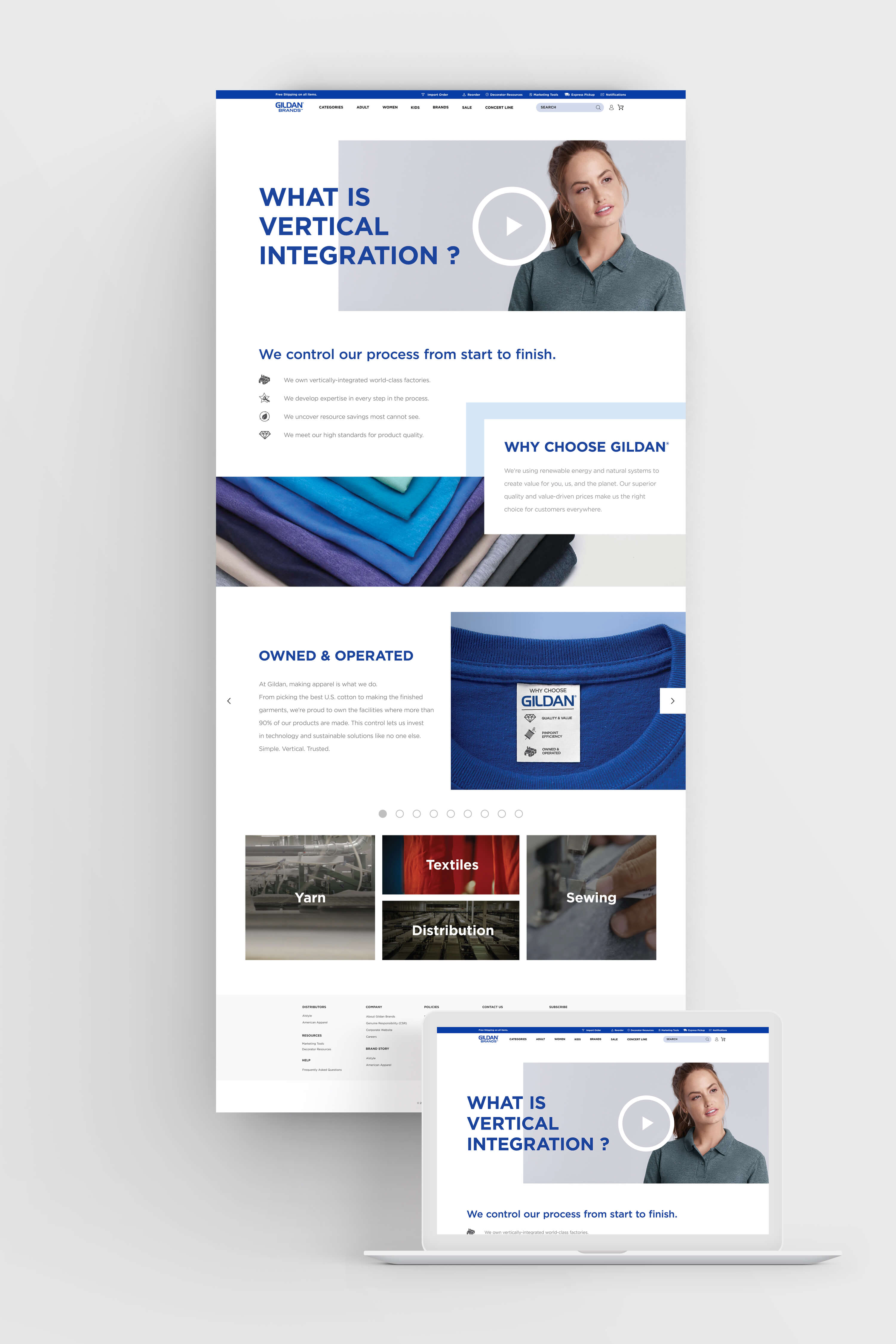
Gildan required a scroll-driven landing page to communicate their vertically integrated manufacturing process — from cotton harvesting to finished garment.
The challenge wasn’t just visual design, but product storytelling: translating a complex supply chain into a digital experience that clearly conveyed brand ownership, sustainability practices, and ethical responsibility.
I shaped the project from information architecture to developer-ready assets, ensuring the landing page was both engaging for public audiences and strategic for internal stakeholders.
Tools.
Wireframing:

Visual Design:

Challenge.
Designing for a corporate sustainability narrative required balancing clarity, credibility, and storytelling.
The product goals:
Simplify complexity — turn a detailed supply chain into an intuitive, linear experience
Build trust — reflect Gildan’s values of sustainability and ethical manufacturing
Guide with purpose — structure content into clear, scroll-friendly modules without relying on excessive interactivity
Reinforce brand — apply Gildan’s visual identity consistently while supporting readability and flow
Process.
1. Discovery & Information Architecture
Reviewed supply chain documentation, sustainability reports, and brand guidelines
Mapped the vertical integration journey into digestible content stages
Defined a narrative structure that moves users seamlessly from raw materials → production → distribution
2. Wireframing & Visual Exploration
Built wireframes in Figma to test hierarchy, pacing, and scannability
Designed custom iconography to visually simplify dense information
Applied brand color palette (Gildan Blue) and bold typography to maintain corporate consistency
3. High-Fidelity Design & Developer Handoff
Refined layout using a modular grid system for rhythm and balance
Optimized typography, imagery, and whitespace to enhance readability across devices
Delivered layered assets, style guidelines, and annotated specs for seamless developer integration
Final.
A polished, scroll-driven landing page that transforms Gildan’s vertical integration story into a clear, engaging, and brand-aligned digital experience.
The design works on two levels:
For public audiences — it makes complex processes accessible and transparent
For internal stakeholders it serves as a communication tool reinforcing Gildan’s sustainability and operational excellence
Insights.
Learned how to translate intricate supply chain data into scannable, human-centered modules
Strengthened ability to balance corporate brand expression with UX clarity
Developed a narrative-first approach to content-heavy design
Gained experience in crafting a visually compelling product story without depending on interactivity

Overview.
Role: Product Designer — Information Architecture, Visual Design, Prototyping
Timeline: 2 Weeks (In-House Project)
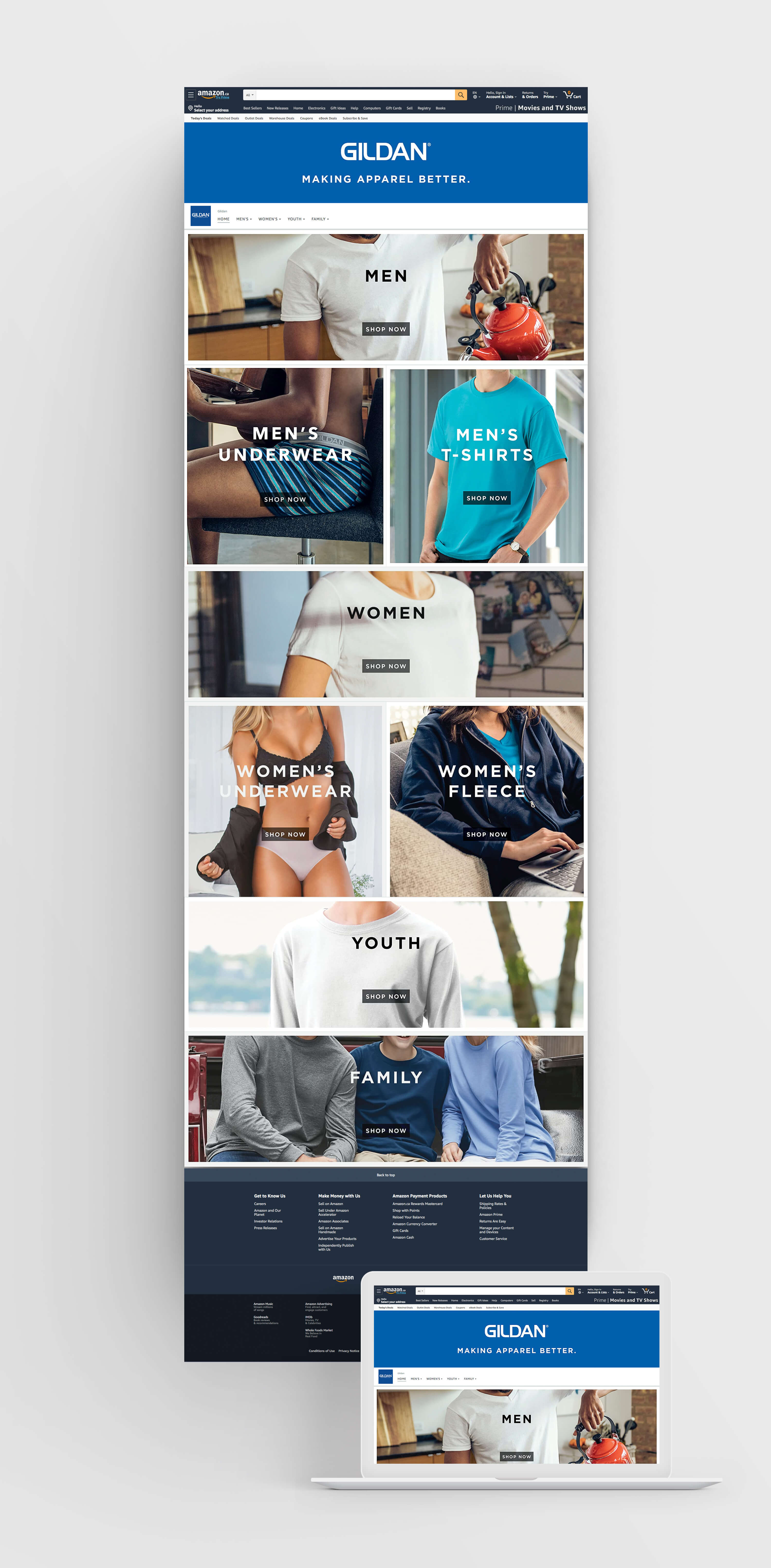
Gildan required a dedicated Amazon home page to strengthen brand presence and improve the customer shopping journey. The challenge was to design within Amazon’s existing UI framework while still communicating Gildan’s identity, product depth, and category structure.
I translated Gildan’s brand system into a modular storefront layout that introduced:
A branded hero banner to establish identity within Amazon’s ecosystem
Category-driven navigation across Men’s, Women’s, Youth, and Family
Modular product entry points optimized for scroll-friendly browsing
Tools.
Wireframing:
Visual Design:
Challenge.
The product challenge was to create a storefront that balanced brand storytelling with Amazon’s conversion-focused design patterns.
Key considerations:
Embed Gildan’s brand identity without breaking Amazon’s UI standards
Design a category-first navigation system that felt intuitive for customers
Establish a clear visual hierarchy between banners, categories, and subcategories
Ensure the layout remained scalable as Gildan’s product lines grow
Process.
1. Discovery & Information Architecture
Reviewed Amazon vendor storefront patterns and Gildan brand guidelines
Structured content into banner → navigation tabs → primary category buttons → secondary product tiles
Designed for a scroll-friendly experience that supported layered engagement
2. Wireframing & Visual Exploration
Designed a branded hero banner positioned beneath Amazon’s global header
Integrated navigation tabs (Home, Men’s, Women’s, Youth, Family) for clear entry points
Established a button hierarchy: large rectangular category buttons, supported by square subcategory tiles
3. High-Fidelity Design & Developer Handoff
Applied Gildan’s blue palette for brand recognition
Balanced imagery, typography, and white space for clarity across modules
Delivered layered assets, button states, and layout specifications to streamline Amazon implementation
Final.
The resulting Amazon storefront established a clear, branded shopping environment while working seamlessly within Amazon’s interface.
Key outcomes:
A structured hierarchy guiding users from banner → categories → subcategories
A balanced approach between Gildan brand storytelling and Amazon’s conversion goals
A modular design system flexible enough to expand with future product lines
Insights.
Strengthened ability to embed brand voice into restrictive third-party platforms
Learned to design for conversion and clarity within Amazon’s commerce-first ecosystem
Developed a scalable, modular system that balances storytelling with shoppable flows
Reinforced skills in information architecture and visual systems design

Overview.
Role: Product Designer — Information Architecture, Visual Design, Prototyping
Timeline: 2 Weeks (In-House Project)
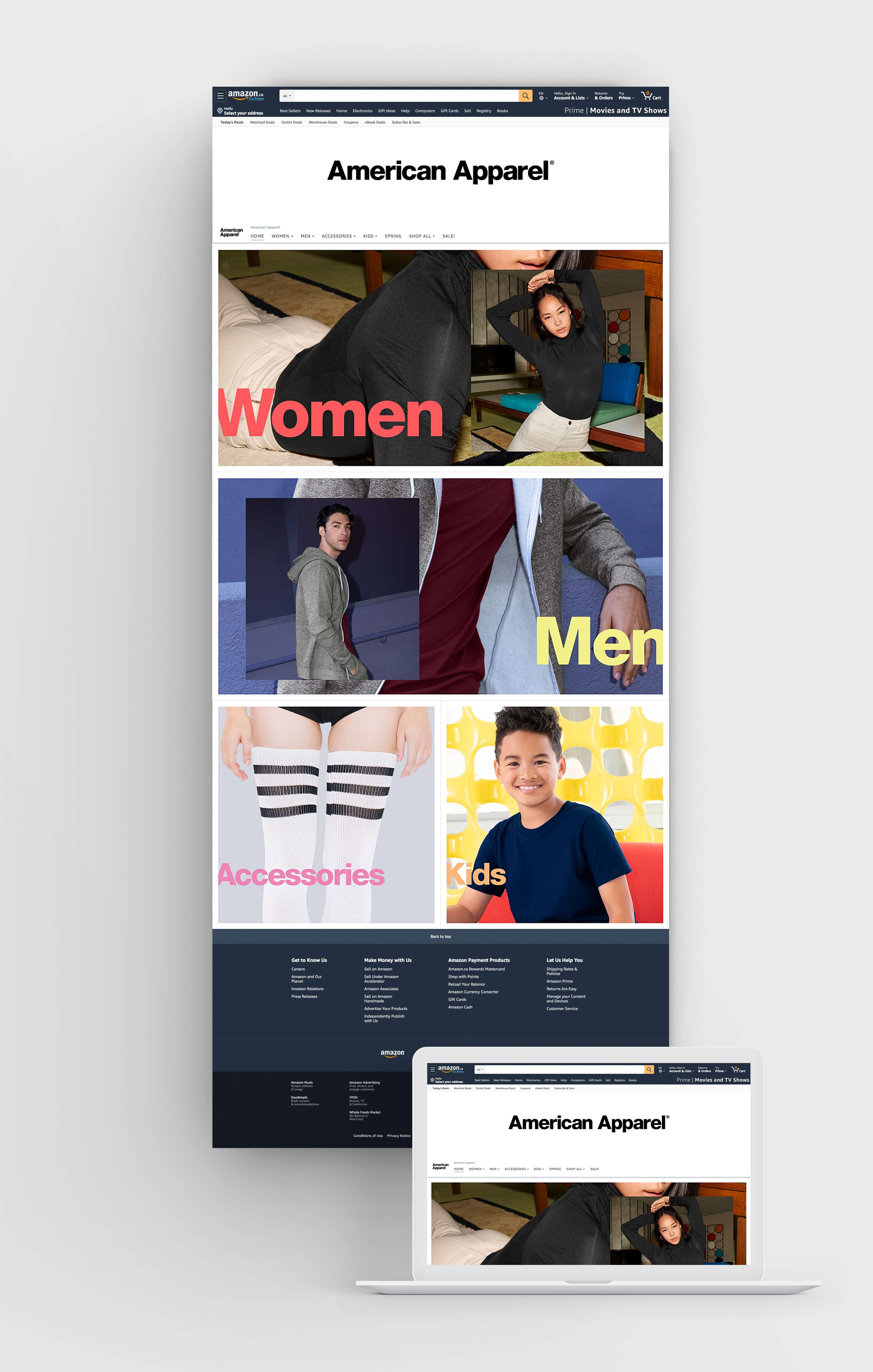
American Apparel required a branded Amazon home page to reintroduce its bold, fashion-forward identity within Amazon’s structured ecosystem. The design applied minimalist layouts, clean typography, and vibrant brand colors to create an immersive storefront that felt distinctly American Apparel while maintaining Amazon’s usability standards. The layout prioritized category clarity and seasonal shopping flow, helping customers easily explore Women’s, Men’s, Accessories, Kids, and promotional collections.
Tools.
Wireframing:
Visual Design:
Challenge.
Craft a storefront that:
Highlights American Apparel’s modern, minimalist identity while respecting Amazon’s UI standards
Uses brand-specific colors to distinguish categories at a glance
Expands navigation to include seasonal and promotional categories
Balances fashion branding with Amazon’s conversion-focused layout
Process.
1. Discovery & Information Architecture
Analyzed Amazon storefront patterns and American Apparel’s brand guidelines
Structured navigation around core categories (Women’s, Men’s, Accessories, Kids)
Planned a vertical scroll flow blending brand storytelling with shopping functionality
2. Wireframing & Visual Exploration
Created a modular header composition, with American Apparel’s profile image on the left and navigation on the right
Leveraged high-quality photography to enhance category buttons, making each section visually engaging and immediately recognizable
Applied brand color system to category entry points for recognition and consistency
Used typographic treatments and color accents aligned with brand standards
3. High-Fidelity Design & Developer Handoff
Applied American Apparel’s minimalist design language with bold use of white space
Designed color-driven call-to-action buttons to clearly segment categories
Delivered layered assets, navigation specs, and button designs for development precision
Final.
The final storefront created a fashion-forward, streamlined experience that elevated American Apparel’s identity within Amazon. The black-and-white minimalist header, paired with vibrant color-coded categories, delivered instant brand recognition while ensuring clean and intuitive navigation.
Insights.
Maintained American Apparel’s bold, minimalist identity within Amazon’s framework
Applied brand colors strategically to distinguish categories and build visual energy
Delivered a clean, modular layout that balances fashion branding with e-commerce functionality
Overview.
The Family of Eateries app was designed to streamline the dining reservation experience for three distinct restaurants: FiveVines, Ceviche, and Crispy’s. Each restaurant offers a unique atmosphere and culinary experience, yet customers previously had to navigate separate booking systems or call in to secure a table. This app consolidates the reservation process into a single, user-friendly platform, allowing diners to browse availability, make reservations, and receive confirmations seamlessly. With the growing demand for digital convenience in the restaurant industry, the goal was to create an intuitive system that not only simplified table bookings but also enhanced customer engagement and brand visibility for each restaurant.
Process.
Developing the Family of Eateries app required a strategic approach to seamlessly integrate three unique dining experiences—FiveVines, Ceviche, and Crispy’s—into a single, user-friendly platform. Our goal was to create an intuitive reservation system that allowed users to book tables effortlessly while highlighting the distinct atmosphere, cuisine, and availability of each restaurant. From initial research and wireframing to development and testing, our process focused on designing a smooth and efficient user journey. We prioritized functionality, aesthetics, and performance to ensure that customers could easily browse, select, and secure their dining experiences with minimal friction. Below, we detail the key phases of our development process and the decisions that shaped the final product.
Tools.